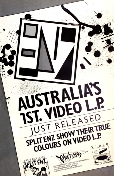
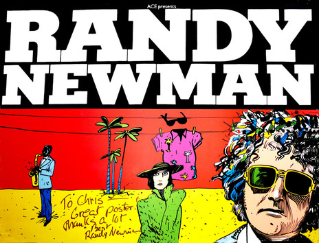
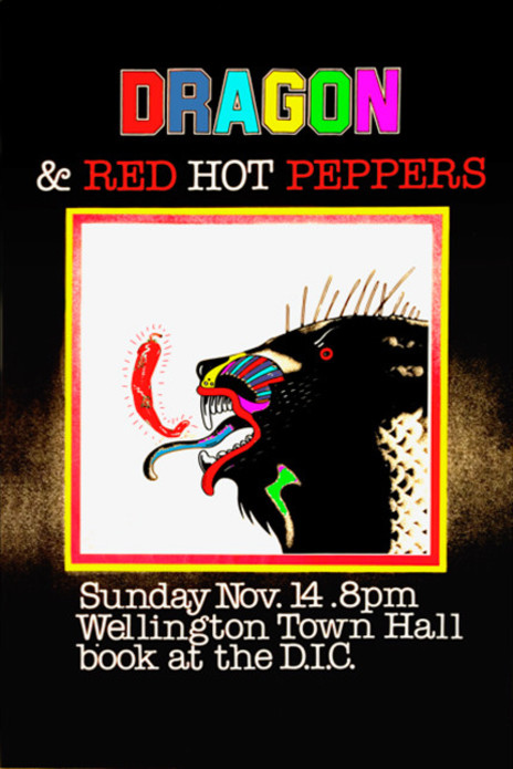
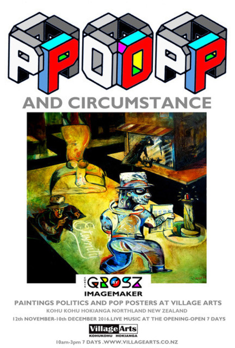
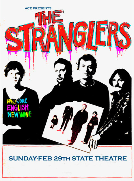
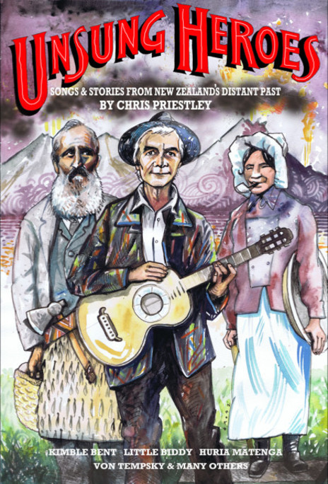
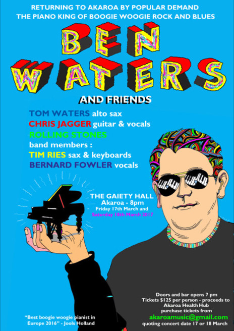
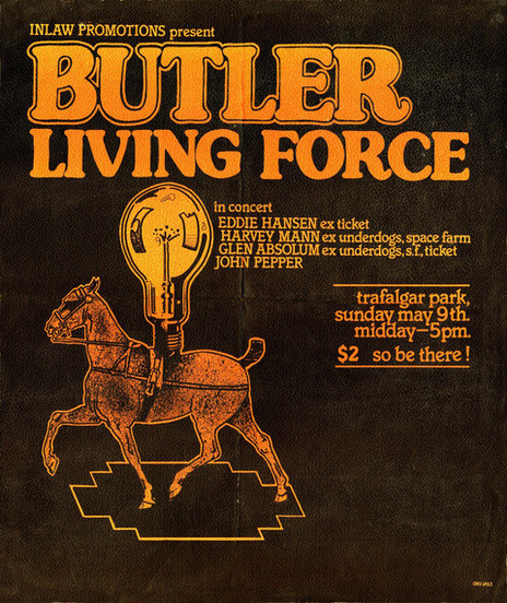
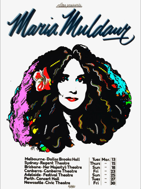
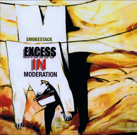
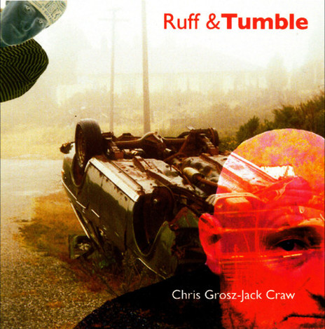
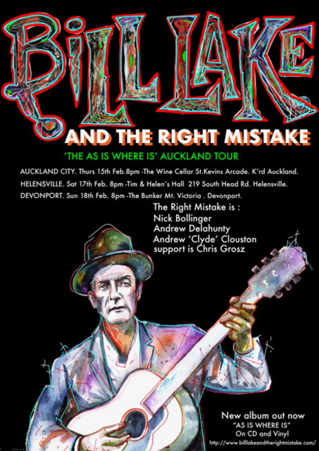
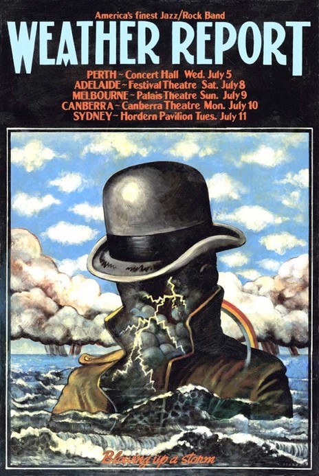
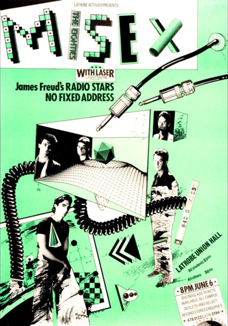
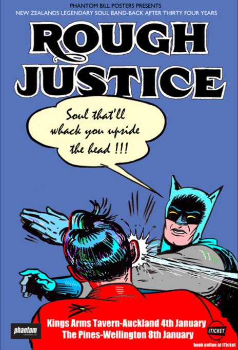
“I always tried to make the poster suit the artist,” he says. “I thought of them as visual songs. I’d say okay, this is the hook, that’s the bridge, there’s the name up there and the venue is where we’re gonna play. I’d design a poster in such a way that if you were on a bus and the bus roared past you could still see it, still read it. Make sure the name of the band was up big, everything about it was strong and graphic.”
Grosz grew up in a home full of art and music, unusual for suburban Christchurch in the 1950s. His father, born in Austria and part-Jewish, was at university in Berlin when Hitler came to power. “He was in the Social Democrats and he got beaten up by the Brownshirts – he still had the scar on his forehead – and the Nazis were on his arse. He somehow got to England where someone sponsored him to come out to the colonies to teach local furriers how to cut possum skins and turn them into nice shapely clothing.”
“I’d design a poster in such a way that if you were on a bus and it roared past you could still read it.”
In Christchurch, Grosz’s father became a member of The Group, an informal art association formed to provide an alternative to the conservative Canterbury Society of Artists. The Group at various times provided a platform for such modernists as Colin McCahon, Toss Woolaston and Rita Angus.
Chris remembers family picnics at which his father would set up an easel and paint en plain air, wearing one of his collection hats: an Indian topi, Turkish fez or a pith helmet. He painted abstracts, sometimes incorporating Māori elements such as the koru. At home he would play the balalaika or listen to records of Dave Brubeck. “I remember every morning the smell of coffee. He always had salamis and dill pickles in barrels and made apple strudels and cheesecakes, and dumplings out of semolina and chives. I couldn’t understand these other kids at school who had peanut butter or marmite sandwiches.”
Chris’s mother, though born in New Zealand, made her own contribution to the exotic atmosphere. “My mother had some connection with the Polish embassy and we used to get this magazine called Polska, and another magazine, Graphis, that came out of Switzerland.”
Chris’s interest in visual arts developed in parallel to an interest in music.
Flamenco was an early discovery. “Not that I wanted to play flamenco, but just that driving gypsy sound. Anything with rhythm in it, that makes you want to get ants in your pants, that’s what got me going. And that included visuals. If the pictures jumped off the walls and disturbed me in some way, that’s the same thing as rhythm-driven music.”
At Burnside High School he met Bill Hammond, a fellow music enthusiast and visual artist. “He was in this band that did Shadows and surf stuff. He was the drummer. He grew up listening to Joe Morello and Gene Krupa. My first instrument was congas, which he taught me.
“My first group was the Doug Hitchens Quartet at high school. Doug played clarinet and his brother played piano and we did songs from the shows, like South Pacific and Oklahoma and I played congas with brushes.”
Grosz and Hammond worked together on the Gestetner-printed school magazine, experimenting with graphic techniques such as drawing directly onto wax stencils.
On leaving school, Chris took a printer’s apprenticeship and stepped into the last days of a dying tradition. “It was all these guys with green eye-shades and pinstripe suits, smoking pipes. They made me fill up their water jars, wash their brushes and sharpen their scalpels. But I learned so many things from them because they were old school technicians. I learned scraperboard, before Letraset came along. It’s basically a clay surface board and you paint on it with ink, let it dry and then you use a scraper and cut it back like a lino cut.” He also learnt hand lettering, and how to make marbled paper for legal ledgers.
As a printer’s apprentice Grosz experienced the last days of a dying tradition. “I learnt so many things.”
By this time the “British invasion” bands had supplanted the Shadows in the teenage consciousness and popular local bands were playing their version of rhythm and blues. Chris became a regular at The King Bee (later renamed The Stage Door), a basement club in Hereford Street where resident band Chants R&B played what Chris describes now as “proto-grunge and garage rock”: covers of blues and R&B songs via British invasion bands such as the Pretty Things and Them.
The Chants also learned songs from more direct sources. Since the mid-1950s Christchurch had been the staging post for Operation Deepfreeze, the US military’s Antarctic operation. American servicemen stationed at Harewood were out and about in the city. Some had brought music; obscure R&B records straight from the jukeboxes of the American south. Local stars including Max Merritt, Ray Columbus and Geoff Cavendar would befriend the servicemen and buy, beg or borrow the records from which they embellished their repertoires.
Chris developed a preference for the more esoteric country blues. “There was this guy called Gary Rogers who was a photographer and a jazz drummer, and he used to have these big parties in his house and all these Americans would turn up. There’d be some guy with a bunch of records he’d brought straight from the States, all these Folkways albums – Lightnin’ Hopkins, Bukka White. We started listening and thought, ‘We could try this.’”
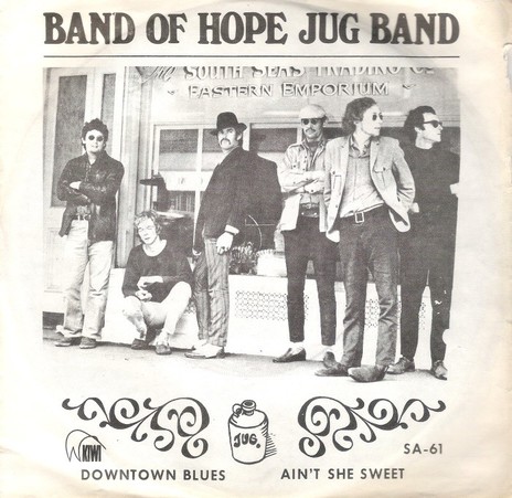
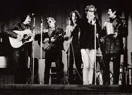
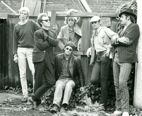
A fellow frequenter of the Rogers parties was local musician Warwick Brock. In early 1967 Grosz, Brock and Hammond formed the Band of Hope Jug Band, an acoustic group favouring rural blues and peppering the set list with hokum and novelty tunes. Before long they were performing at venues around town: the Folk Centre, El Segundo, Ram Jam, the Plainsman and the Stage Door.
Grosz had a memorable encounter one night at the Plainsman. “I was out the back, this middle-class dude with a Dobro trying to play slide, and I remember this big black hand came over to my shoulder and” – he imitates a deep southern American voice – “‘No man, like this’. And he took the guitar off me. I remember exactly what he played. It was a blues lick and he was from Alabama. He said things like ‘Why are you guys interested in this music?’ ‘Because it’s just so damn good! It’s just not like this pap we’re being fed out of the radios all the time.’”
Chris had designed some posters for his friends in the Chants but when it came to the Band of Hope he had competition. “The problem with the Band of Hope was there were five graphic designers in the band: Warwick Brock, Darryl Watt, Dennis Hearfield, Bill Hammond and myself. So when it was time to do the album cover Warwick, who was the most opportunistic, managed to get onto the job and had it all ready to go.”
The Band of Hope Jug Band’s self-titled album was released on Kiwi in 1968 (other members at the time were Phil Garland and Gordon Collier). A second album was recorded later that year but the band broke up and it has only appeared as a bootleg.
The Band of Hope Jug Band featured five top graphic designers.
Chris moved to Auckland after that. First night in the big smoke he headed to the Kiwi Tavern, near the university: a popular watering hole of the burgeoning counterculture, where he met Dick Frizzell. “We got very drunk and I went back to his place and stayed there for a year. Dick at that time was an animator, I think. Animation, design – all of those things melded, it wasn’t specialised like it is today. It was all from the skill of drawing. I remember helping him get together a folder. He went off and ended up working with Bob Harvey.”
Before long, Chris had fallen in with another jug band, the Auckland-based Mad Dog Jug Jook and Washboard Band. He had first seen them play at a Wellington folk festival and realised that here was “the sort of jug band music I’d always wanted to play, the real deal, no novelty shit. Memphis Jug Band, Washboard Sam, Sleepy John Estes, and these guys could play it.”
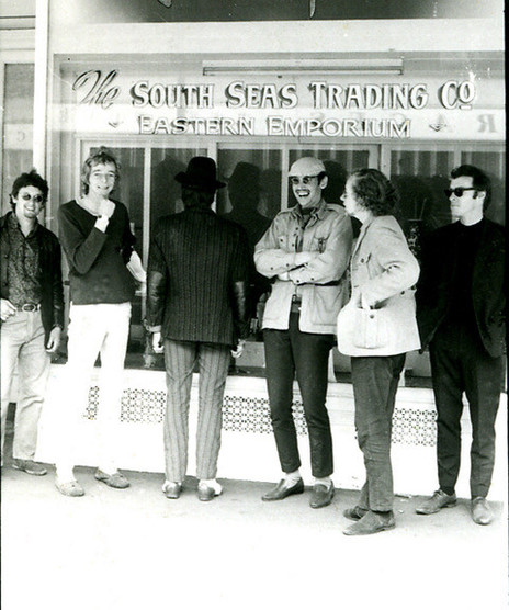
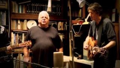
He joined the Mad Dogs, which included guitarists Tom Cranitch, Robbie Lavën and Pete Kershaw (the latter two would become members of Red Hot Peppers) and harmonica player Andrew Delahunty who would go on to play with the Windy City Strugglers. Chris joined, playing a variety of instruments – harmonica, banjo, guitar, percussion.
“It was a wild band and we played around a lot. We went down to Wellington and played with the Windy City Strugglers. Someone produced some opium, which I hadn’t had before. There’s a picture of me and Andrew Delahunty playing together and we’re leaning against each other, supporting each other ’cause we’re so out of it.”
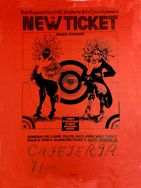
They also played in Auckland and Hamilton, including a stint at the National Banjo Pickers’ Convention. But by the end of the 60s the Mad Dogs had split and Chris was back in Christchurch, again working as a freelance graphic artist. A regular gig in the early 70s was designing a weekly poster for the Velvet Glove, a pub venue that hosted psychedelic rock bands such as Ticket and Butler.
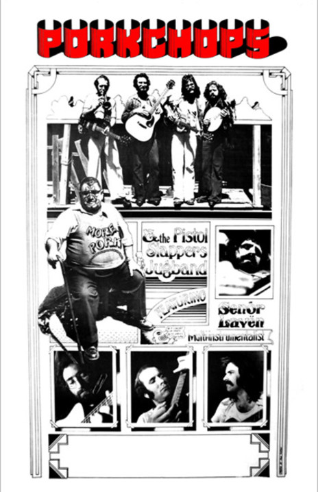
He also found work in television, making credits for locally made programmes. Though the NZBC’s design budget was minimal, Chris remembers it as a place where he had creative freedom and a lot of fun. Ballet, wrestling, kids’ shows, The Country Touch with Tex Morton – Chris brought his “rock’n’roll sensibility” to the graphic style of all programmes. He continued to keep his hand in with music, forming the band Pork Chops, which included drummer Steve Garden and, for a brief period, Robbie Lavën.
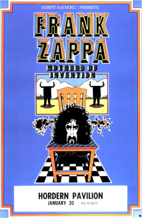
It was during his time in television that he landed his first international design job: a poster for the 1976 Australian tour by Frank Zappa and the Mothers of Invention. A colleague, Roger Griffiths, had been offered the job by promoter Robert Raymond but “he was so freaked out he could not get his head around it. I had a fairly clear idea about what could be done so I did this very detailed rough and sent it off to Raymond and he loved it. Zappa himself liked it, so I heard. No one could believe it was designed in Christchurch. They all thought it was an overseas poster and I took that as a compliment.”
For his Frank Zappa poster in 1976 Grosz used “eyeball-searing flat colours.”
The Zappa poster was A2 size – larger than Chris had worked before – and printed using the offset technique in “eyeball-searing flat colours. That’s a graphic tradition I got from 1920s French posters. Flat strong colours with bold black lines. Comics were like that too, the Carl Barks/Disney comics. I was also highly influenced by Pushpin Studios in New York, which was Milton Glaser who did that wonderful famous Bob Dylan poster.”
Another big influence on his work at this time was the Hamburg-based designer Heinz Eidelmann, largely responsible for the psychedelic landscapes of the Beatles’ Yellow Submarine movie.
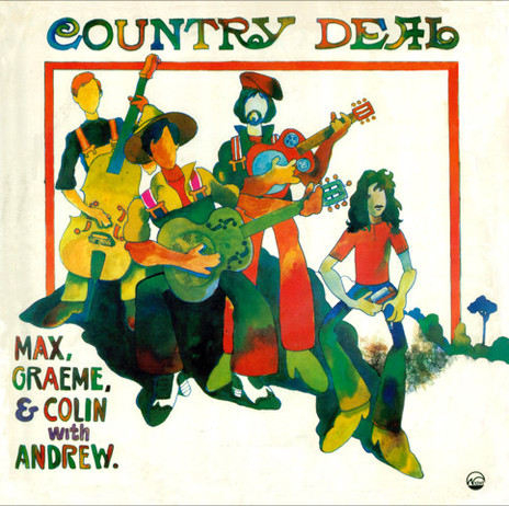
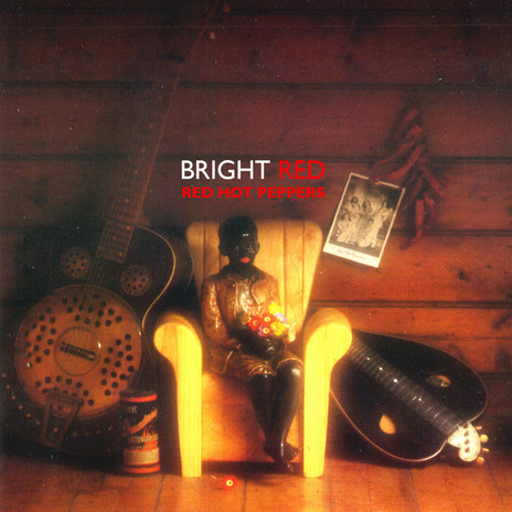
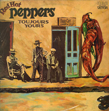
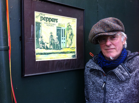
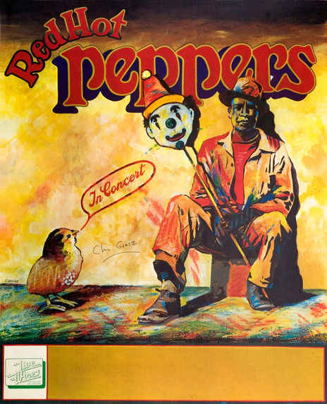
New Zealand bands continued to call on his services. Over the next few years he would design album covers for Max Winnie and Graeme Nesbitt’s Country Deal; posters for Dragon; covers and posters for Robbie Lavën’s Red Hot Peppers, and more. The Peppers’ poster stood out as the rare local design to use full colour, and employed a font based on an 1890s Chicago signwriting style, found in a book given to him by Hammond. Other fonts were derived from rubbings Chris took off gravestones in local cemeteries. For a Dragon poster he emulated the airbrushed technique popular at the time. Not having an actual airbrush, he devised his own method, using a toothbrush to distribute a fine film of paint.
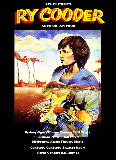
In 1976, now with a wife and children to support, he moved to Melbourne where a well-paid job in an advertising agency left him enough time to continue his poster work on the side. The Zappa and Peppers posters got him an introduction to Michael Coppel, then running a fledgling promotions company out of Flinders Lane in Melbourne. Coppel liked Grosz’s work but quibbled over the fee. “I had a job so I said, ‘How about I do the first poster free but you give me a whole lot of tickets?’ He said ‘Okay, how about Ry Cooder?’ ‘Okay, fine.’ I was imagining getting twenty tickets in the front row but I only got two, cheap bastard.
“I met Cooder later. I got yarning with him over the bonnet of my car outside the hall. He said ‘So you painted the poster? Why did you paint me from the side showing my bung eye? I’ve got a glass eye.’ I didn’t know that. I said Warner Brothers gave me one black and white photo. That was the only reference I had.”
“The next one after that was Tom Waits. Coppel didn’t like it. I said, ‘it’s not for you, it’s for his fans.’ Every poster I did with Coppel there was some kind of argument.”
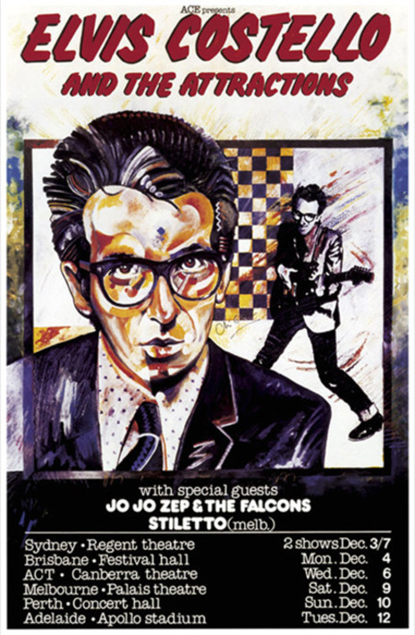
Through posters for tours by Graham Parker and Elvis Costello (who complained that Chris’s oil-painted portrait of him was “a bit arty”), Chris met Jake Riviera, Costello’s manager and co-founder of the Stiff Records label. Riviera invited Chris to visit their London headquarters, which he did in the early 80s. There he met Stiff’s in-house artist Barney Bubbles.
“I thought, that’s an interesting name. I thought all the punk artists had names like Vicious Vomit or whatever and he was just another one of them, but he was doing this very sophisticated artwork. He was quite a shy guy, he was behind this desk and there was paint everywhere. He’d just done a cover design for an Ian Dury album called Do It Yourself and he’d used paint circles from tins of paint, primary colours on black, and I thought ‘Wow that’s a great idea.’
Grosz showed UK designer Barney Bubbles his work in 1979. “Get rid of that hippie shit,” he said.
“I showed him my work and he said, ‘Get rid of that hippie shit’. That was his only advice. ‘What do you mean?’ He said, ‘Well you don’t come from San Francisco, do you?’”
As it turned out, Barney Bubbles (real name Colin Fulcher) had acquired his nickname for the bubbling coloured oil lightshows and psychedelic album covers he used to design in the late 60s and early 70s for hippie bands such as Quintessence and Hawkwind. Still, his advice left an impression. “Slowly this idea percolated in my brain and I started to use more graphic, stronger simpler things, but idea-driven.”
Back in Melbourne he put that “stronger simpler” graphic style to use in poster designs for recent arrivals from New Zealand, Mi-Sex. “It was the 80s, it was all new wave and punk, and I remembered that conversation with Barney Bubbles so I thought I’ll try a collage, which I’d never done before.”
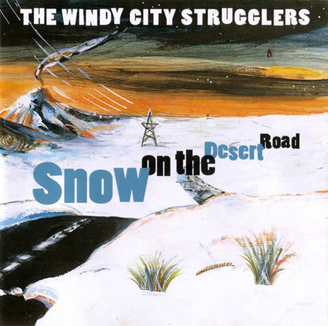
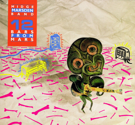
He also looked increasingly to New Zealand’s culture and landscape for inspiration. For the cover of Midge Marsden Band’s 12 Bars From Mars, designed with his friend Bill Hammond, he used a tiki motif. On the Windy City Strugglers’ Snow on the Desert Road he depicted an iconic section of Highway One.
By the mid-80s he found the demand for band posters in his Melbourne base was receding. Venues were replacing live music with deejays whose promotion usually consisted only of a chalkboard on the street. Chris took a job in Hong Kong as the graphic designer and political cartoonist for a newspaper.
For the Australian magazine The Monthly, from 2005 he illustrated a long-running series of columns by Shane Maloney, describing unusual encounters by well-known visitors, for example, Elvis sparring with Aboriginal boxer Lionel Rose. This became an animated series for the ABC, which required 1200 original drawings.
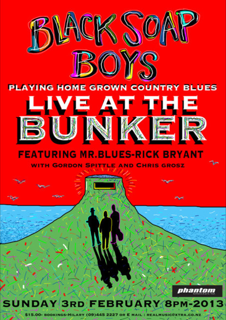
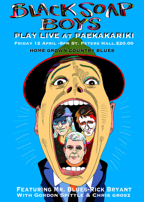
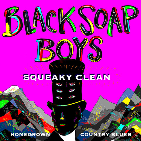
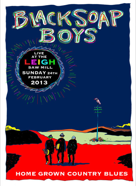
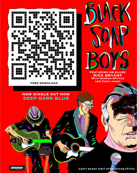
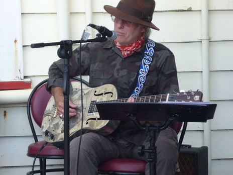
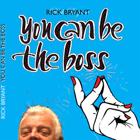
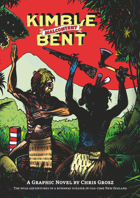
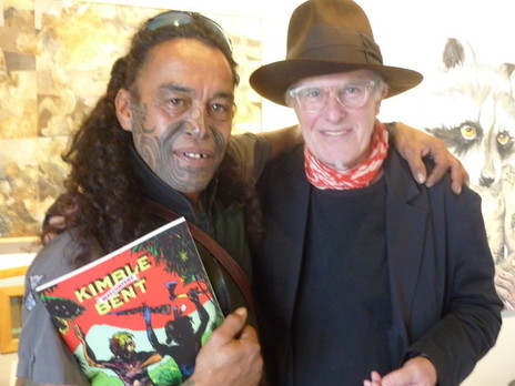
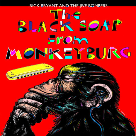
Within a few years Grosz returned to New Zealand where – using the scraperboard technique from his printer’s training – he composed the graphic novel Kimble Bent: Malcontent, based on the true story of the former British soldier who sided with Māori in the colonial wars. He also reconnected with some of his old musical colleagues. In Auckland he began playing in a semi-acoustic line-up with Rick Bryant and Gordon Spittle as the Black Soap Boys. Naturally he designed their posters.
For AudioCulture in 2021 he created the 12-part Rock & Roll Rendezvous series, illustrating bizarre encounters between New Zealand musicians and characters from history.
