How do we visually identify music? In the era of downloads and digital files we might see a tag or jpeg, the vestigial remnant of the 20th century “record cover”. But – much like the human appendix – what part of the original organ’s function do these tiny pixels serve?
In the vinyl age, record covers tended to codify their visual presentation based on genre, target audience, price point and the particular tastes of a label’s owners and art directors.
Once the rock and roll revolution settled into comfortable stasis there were, more or less, a series of interchangeable templates that served the visual requirements of the product. “Weird”, “sexy”, “dangerous”, “obscure” and so on – all were available in the portfolio of styles used to dress up the musical content.
But what of the outlier genres, those marginal catalogues on the fringes of the record industry? How should one dress for a party sound tracked by the exotic and indigenous, the songs and dances from foreign lands?
Such was the challenge enthusiastically embraced by the owners and operators of New Zealand’s nascent music business in the 1950s and early 60s as they expanded their catalogues to include the sounds of the South Pacific. The results were often stunning, occasionally perplexing, but always fascinating.
Aloha Samoa (1962)

Aloha Samoa - The Samoan Surf Riders (with Bill Sevesi & His Islanders), Viking Records, 1962, designer unknown
The graphic design writer, Steven Heller, calls it “Typography Parlant”, but anyone who has looked at a dairy’s “Ice” sign (brrr …) or studied the flaming letterforms on a particularly fiery bottle of hot sauce will probably understand the concept more prosaically as a typeface that describes its function.
Common examples are the looping rope letters on a pair of Wrangler jeans, or the electrified font we might see on the door of a power station. But I’m taking bets, right here right now, that the cover of Aloha Samoa is the only time in graphic design history that the stout, decidedly plain root of the taro plant has featured as the central typographic element in a visual layout.
Aloha Samoa is one of the oddest slices of kitsch you’re ever likely to see. It is, quite literally, fantastic, collaging a racy photographic study against amateur dramatic stage-set palm fronds and an apocalyptic sunset. But, as far-fetched and psychedelically exotic as these components undoubtedly are, one’s eyes tend not to linger on them too long because right there, in prime title position, are the lurid illustrated ravings of some kind of mad, graphic genius.
There’s something monstrous about the way the taro root has been rendered, a florid, anatomical vigour that is almost Dali-esque. The (unknown) cover artist bends the forms of the tropical tubers against their stodgy will until – submitting – they concede and contort themselves lewdly into the appropriate capital letters.
It’s an outstanding and outlandish design choice that elevates a piece of South Pacific exotica into a wildly surrealistic nightmare realm. Don’t look now: the taro is behind you!
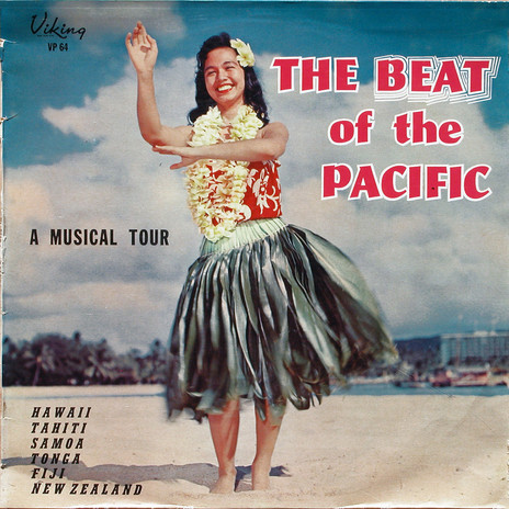
The Beat of the Pacific (1962)

The Beat Of The Pacific - Various Artists, Viking Records, 1962, designer unknown
Hula dancers feature on a lot of the early Viking LPs of Polynesian music. In the filing cabinet of whatever photo agency Murdoch Riley and Ron Dalton used there was surely a folder marked “Hawaii/Girls” that saw a ton of action.
As images they tend to operate in a signal fashion – visual shorthand connoting tropical ritual and native sensuality – or more basely as a photographic siren-song to hook the male gaze of the patriarchal 1950s and 60s.
One presumes the ubiquity of Hawaiian images was due the 50th state’s geographical and cultural prominence in the Pacific. Hawaiian music had established itself as a niche genre and the country’s lush vistas were the kind of visual diversion Hollywood couldn’t help but drool over. And there was, of course, the boom in post-World War II tourism that did wonders to spread the word about the exotic island paradise way out in the cerulean seas west of America.
The effects of this tourism can be seen creeping onto the cover of The Beat of the Pacific in the guise of the shiny new hotel to the right of the hula girl. The album was released in early 1962, when the Waikiki beachfront – from what we can make of it – remains comparatively low-rise.
The LPs’ title typography is not technically “Parlant” but more of a hand-tooled custom job, with go-faster stripes added to RH Middleton’s chunky 1940 Samson font for the requisite urgency. The hip-shaking BEAT – as well as evoking the girl’s seductive dance – highlights the key word in a post-rock & roll youth climate about to be electrified by four young lads from Liverpool.
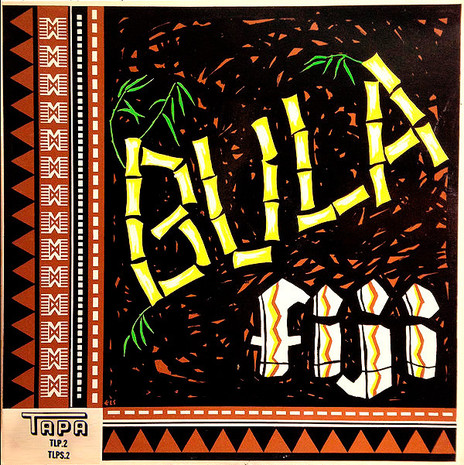
Bula Fiji: A Musical Rendition of Fijian Hospitality (1963)

Bula Fiji - Various Artists, Tapa/Viking Records, 1963, cover painting by J K Payne
Bula Fiji is another fine example of Heller’s “Typography Parlant”. Released by Viking Records in collaboration with the Fiji-based Tapa label, the cover brings together traditional tapa cloth design – decorated with the Fijian comb motif – and energetic lettering that falls just the right side of being crudely rendered.
Bamboo was a common “Parlant” theme and in less culinary-enlightened times it was often used as the novelty typeface on Chinese takeaway restaurant signage and menus. During the tiki culture craze of the 1950s and 60s bamboo lettering could also be seen in the kind of bars that served mai tais in pineapples and had Andy Williams’s bongo-tastic ‘House of Bamboo’ blaring out of the jukebox.
Against the jungle-dark scrawl of the cover’s background, J K Payne’s bamboo joints could be regarded as almost sinister – in their bare, bone-like fluorescence – were it not for the delicate green shoots sprouting in the tropical heat.
It’s the sort of vibrant, primitive iconography that gripped a post-war generation seduced by Les Baxter and Martin Denny’s Exotica records and Bula Fiji is a cover that would look wonderful framed on the wall of a basement tiki bar, or nestled amongst the African masks and Arthur Lyman LPs of a space-age bachelor pad.
Aotearoa Maori Entertainers (1956)

Aotearoa Maori Entertainers, Parlophone Records,1956, designer unknown
Released in 1956, Aotearoa Maori Entertainers evokes a design era of British Commonwealth stamp art and the sort of cheerily informative children’s books that inevitably ended their days in the back bedrooms of old seaside baches.
Working with a limited palette of three colours the uncredited designer keeps things nicely balanced between the decorative elements – a tiki and kowhaiwhai band running across the top – and the formal pictorial content. Instead of the traditional red/sepia/black and white, normally used in representations of Māori cultural life, the yellow and green combination here makes the cover really “pop”. Despite the LPs ethnographic/folk, content Parlophone – HMV New Zealand’s local imprint – were in the business of selling records and an attractive cover design did a lot to improve the commercial prospects of a new title.
Printed via the letterpress method – with three separate plates for each discrete colour – the telltale hand-cut “auras” around the ladies with their poi show how the different pieces of artwork were arranged and aligned by the “stripper” during the pre-press stage of production. (Hair was notoriously difficult to cut around: on the cover of Buddy Holly and The Crickets’ The Chirpin’ Crickets LP from 1957, half of Jerry Allison’s head was scooped out by the over-eager blade of a photo-stripper.)
The title is a combination of script style hand lettering – phonetically breaking down the word Aotearoa for textural effect – and a horizontally shaded lineale overprinted in solid green. It’s a classy design but has clearly dated. The following year the Viking label would begin issuing similar material and – while some of those early releases follow the template used here on Parlophone’s Aotearoa Maori Entertainers – the independent label’s catalogue would soon be forging its own visually distinctive path.
Rarotonga Calling (1964)

Rarotonga Calling - Pepe and the Rarotongans, Viking Records,1964, designer unknown
If the colours on the previous cover “pop” then on Rarotonga Calling they positively explode. Out of a fire-engine red background a sultry lass – from the heavily thumbed “Hawaii/Girls” folder no doubt – radiates her come-hither charms to the accompaniment of a blaring typographic klaxon. Rarotonga isn’t just waiting out in the sparkling South Pacific, no, it’s calling you, fool – and you’d best drop everything and get over there, pronto.
It’s certainly a great Christmas cover. The red wrapping paper is already peeled away to reveal the luscious Technicolor artifice within and our old friend bamboo and some potted ferns do their best as ersatz jungle. But there’s a sheen of Hollywood glamour here that suggest this particular photo shoot originated sometime earlier than the LP’s release date. (The model shares a striking resemblance to the French-Tahitian actress Tarita who stared in the 1962 remake of Mutiny on the Bounty. Marlon Brando was so impressed, he married her.)
Rarotonga Calling is a treat that any vinyl fiend would thrill to find under their Christmas tree, but I suspect it’s fairly rare these days. Still, probably worth a text message to Santa, just in case. Oh, and I’m told that when he’s doing his South Pacific rounds he digs a mai tai in a pineapple rather than a glass of sherry …
--
Read Sound and Vision: Album Design part 1 - here
--
Chris Mousdale is a native of Liverpool, England, living in New Zealand since 1990 where he works as an illustrator, designer and artist. He’s taught Illustration and design at Auckland University of Technology and has held numerous solo exhibitions of his paintings and constructions. In 2003 he won the New Zealand Post Children’s Book Award for Brodie with Joy Cowley. Always active in the music/art industry, Chris served as curator for exhibitions of Brazilian bossa nova LP designs (2000) and co-curated the British Council Sound Design exhibition of New Zealand record covers (2002). His recent design work includes a series of covers for Blue Note Records in association with Music Matters Ltd. This article is the second of a series for AudioCulture.